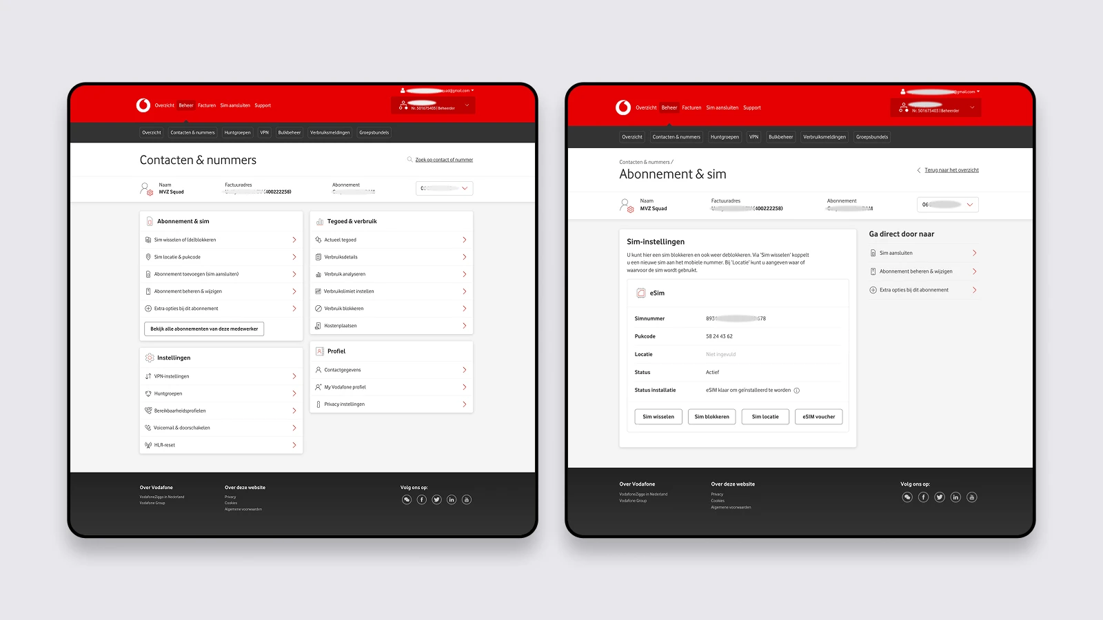
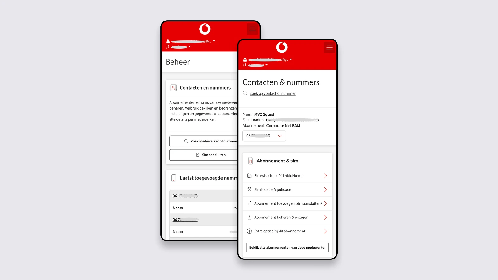
Too many options created unnecessary complexity.
Users often struggled to quickly find the right tool or action.
Subscription management
Summary
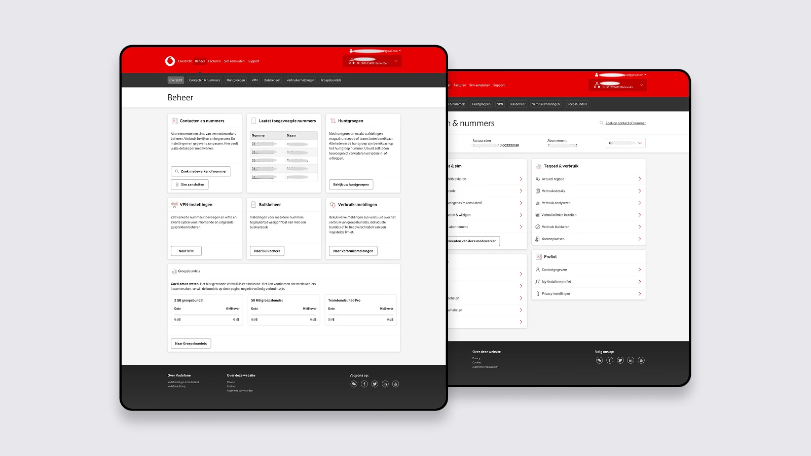
I redesigned My Vodafone Business as part of a wider technical migration.
The portal lets business customers manage subscriptions, users and account details. The migration was an opportunity to align it more closely with their work.
Insights
Business users needed less complexity and a clearer overview.
Users often struggled to quickly find the right tool or action.
Important actions were available, but the structure around them was unclear.
Usage, subscription and account information needed to be easier to find without navigating through multiple areas.
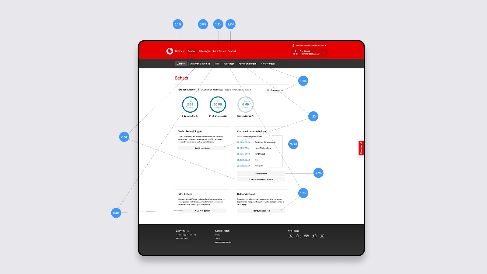
Prototyping
I mapped the main processes, systems and roles, then spoke with business users.
Their frustrations and needs guided decisions about what to simplify or reuse. This led to a clearer structure, updated journeys and new interface concepts.
Co-creation and usability testing helped me refine the main flows until they felt clear and familiar.
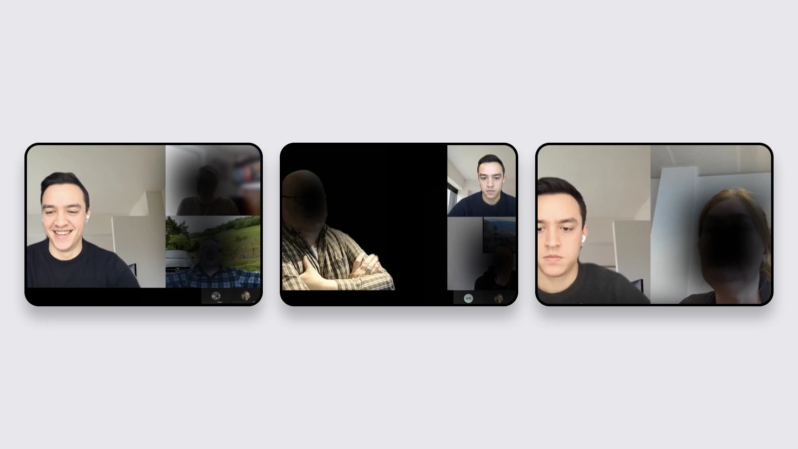
Testing
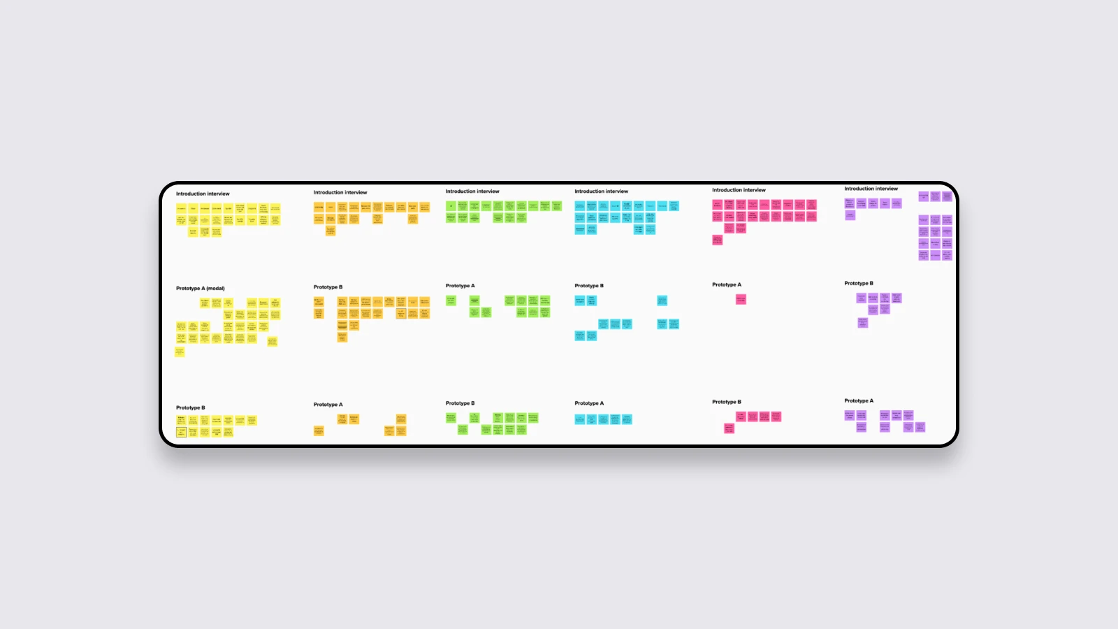
Business users tested the journeys and interface concepts throughout the design process.
Finding everyday tasks and completing important management flows.
Whether users understood the structure and could move through tasks without confusion.
Feedback shaped the navigation, content and main interactions.
Results
The redesigned portal makes common business tasks and account information easier to find and understand.
Business self-service
Subscriptions, users and account information brought together.
~20%
Improvement for common account-management tasks.
~15%
Increase in tasks completed without contacting support.
~20%
Reduction in account and subscription questions.
The new structure better reflects how customers actually manage their Vodafone services and provides a more maintainable foundation for future development.
Complex → structured
A large business portal with a clearer structure.
Legacy → modern
UX redesign aligned with the technical migration.